Back to homepage
Redefined how LinkedIn pipeline for B2B business with Cclarity leads management tool
Role
Senior Product designer
Year
2024 - 2025
Go to
"When I brought Asyrof in, Cclarity had a content product that worked. What it didn't have was a way for clients to see their pipeline. They were trusting us blindly, and trust without visibility has a shelf life. Asyrof solved it."
Keith, Founder of Cclarity
$5M+
Pipeline generated for clients
50+
Founders onboarded through product
7.8K
LinkedIn engagements analyzed
MY ROLE
Led product design end-to-end, from discovery through delivery, covering client-facing tools, internal ops dashboards, and the marketing website.
PLATFORM
COLLABORATORS
Founder/CEO (Keith Teo), Product Manager, Engineering team, and LinkedIn outreach specialists.
SKILLS APPLIED
UX Research · UI Design · Interaction Design · Design Systems · Copywriting · Prototyping · A/B Testing
INTRO
The problem space
LinkedIn had become the most important channel for B2B founders, yet almost every existing tool and workflow was broken, spammy, or both. We needed to rethink the entire experience.
Automation overload & trust collapse
Most tools relied on automated DMs and connection blasts. LinkedIn's algorithm flagged these accounts, and prospects had developed a deep aversion to bot-like outreach, making even genuine founders look spammy.
Signal blindness
Every post like, comment, and share was a potential lead signal, but founders had zero visibility into who was engaging. The team tracked all this manually, creating a 24–48 hour lag between signal and action.
Voice inconsistency at scale
Ghostwritten content frequently felt off-brand or generic. Clients couldn't trust that 5 posts a week would sound authentically like them, killing the personal brand strategy before it had a chance to compound.
Prospect signals going unnoticed
Every post like, comment, and share is a live buying signal, but no workflow existed to capture, qualify, and route these micro-signals into a real pipeline. Enormous value was leaking daily.
DISCOVERY
How I approached a feature with no prior blueprint.
Adding a leads layer to an existing product required understanding both the existing product's mental model and the entirely new workflow I was introducing.
Hotjar product audit
We did daily Hotjar review to keep up with user pain points, what process that might be stuck and stressed users, any untold bugs, etc

Mental model mapping
I mapped the gap between what the current product provided (content confidence) and what clients needed downstream (pipeline confidence). Core Job to be done (JTBD): "When a lead engages with my post, I want to know who they are and what's being done, so I can feel confident something is happening on my behalf." This shaped every subsequent design decision.
Stakeholder interviews & workflow audit
I interviewed 12 founders who had tried LinkedIn outreach and failed, plus 6 who were actively running manual pipelines. I shadowed the Cclarity ops team for two weeks to document every handoff, bottleneck, and workaround they used. The biggest reveal: 40% of team time was spent on tasks that should have been surfaced automatically by a product.
Concept sprints, wireframes & testing
I ran three concept sprints over 2 sprints, one per major surface (signal capture, pipeline board, DM viewer). Low-fidelity concepts were tested with 5 clients each. Key insight from round 1: founders didn't want to manage leads, they wanted to observe them. This reshaped the pipeline from action-first to visibility-first.

DISCOVERY
How I approached a feature with no prior blueprint.
Adding a leads layer to an existing product required understanding both the existing product's mental model and the entirely new workflow I was introducing.
Hotjar product audit
We did daily Hotjar review to keep up with user pain points, what process that might be stuck and stressed users, any untold bugs, etc
Stakeholder interviews & workflow audit
I interviewed 12 founders who had tried LinkedIn outreach and failed, plus 6 who were actively running manual pipelines. I shadowed the Cclarity ops team for two weeks to document every handoff, bottleneck, and workaround they used. The biggest reveal: 40% of team time was spent on tasks that should have been surfaced automatically by a product.
Mental model mapping
I mapped the gap between what the current product provided (content confidence) and what clients needed downstream (pipeline confidence). Core Job to be done (JTBD): "When a lead engages with my post, I want to know who they are and what's being done, so I can feel confident something is happening on my behalf." This shaped every subsequent design decision.
Concept sprints, wireframes & testing
I ran three concept sprints over 2 sprints, one per major surface (signal capture, pipeline board, DM viewer). Low-fidelity concepts were tested with 5 clients each. Key insight from round 1: founders didn't want to manage leads, they wanted to observe them. This reshaped the pipeline from action-first to visibility-first.
Competitor analysis
I looked into other tools that providing some automations, engagement and outreach in LinkedIn fields, and ran SWOT analysis for each tools including Phantombuster, Taplio, Linkbound, etc, and analysed what might works as foundation to be improved for our feature.
ITERATIONS LOOP
Design sprints, sketching & concept validation, repeat.
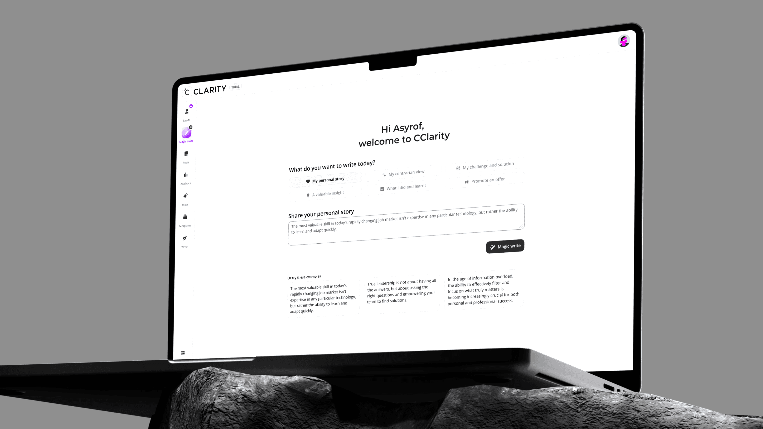
I streamline my design process through AI-assisted iteration. Using Claude AI helps me move faster from concept to solution while uncovering critical context and edge cases that strengthen the overall user experience.


Then, to keep everything feasible in development, I don't send the raw result from AI, but elaborate more using simple metric like "Effort vs Impact diagram" to keep things managable and not wast everybody time

FEATURE DEEP DIVES
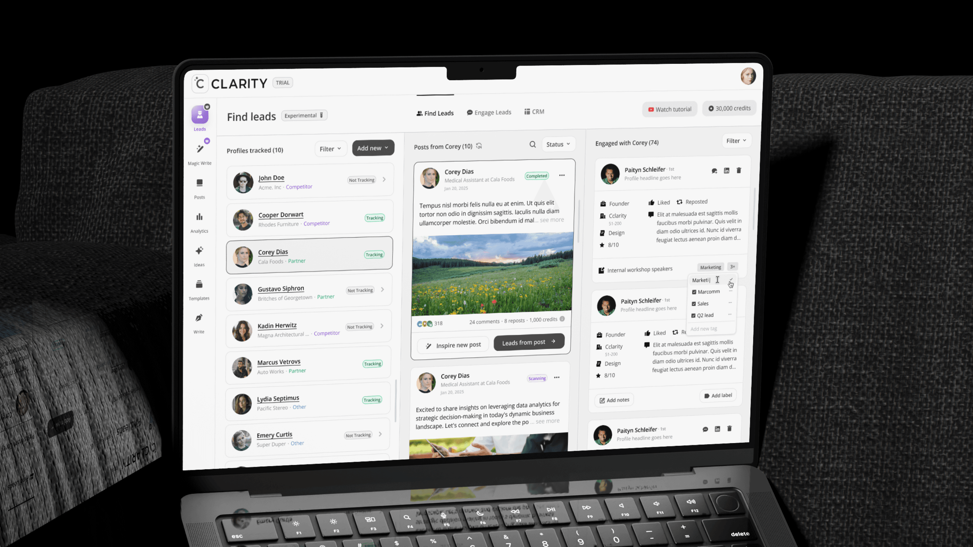
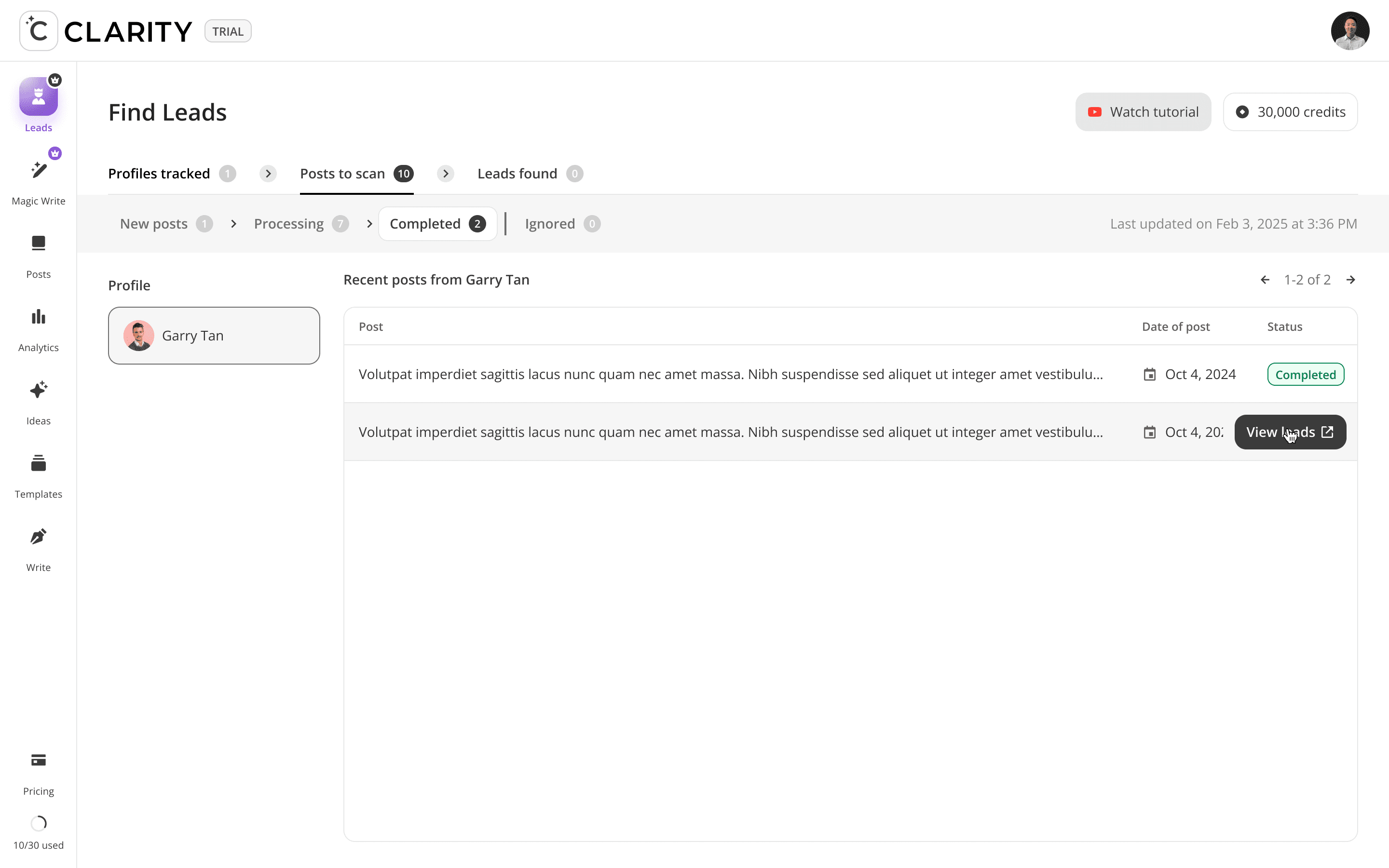
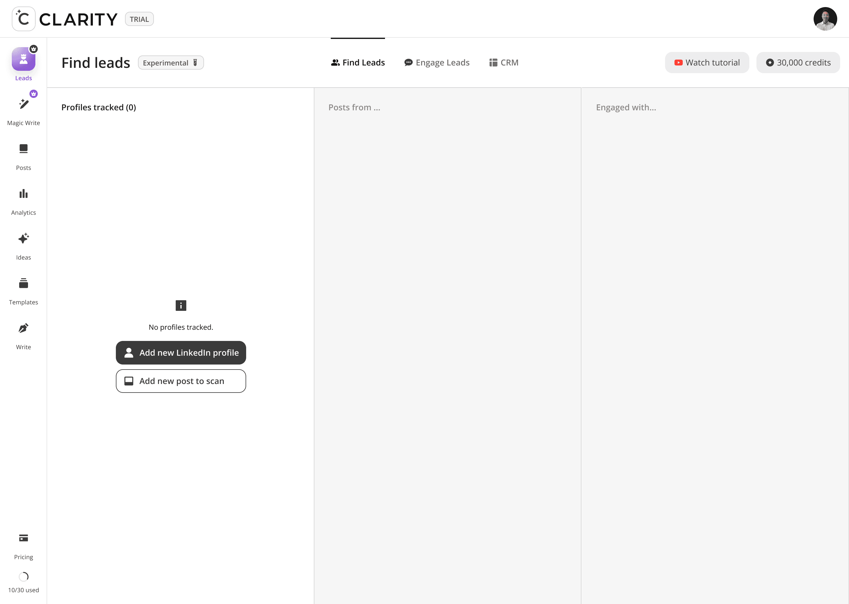
Phase 1: Find Leads
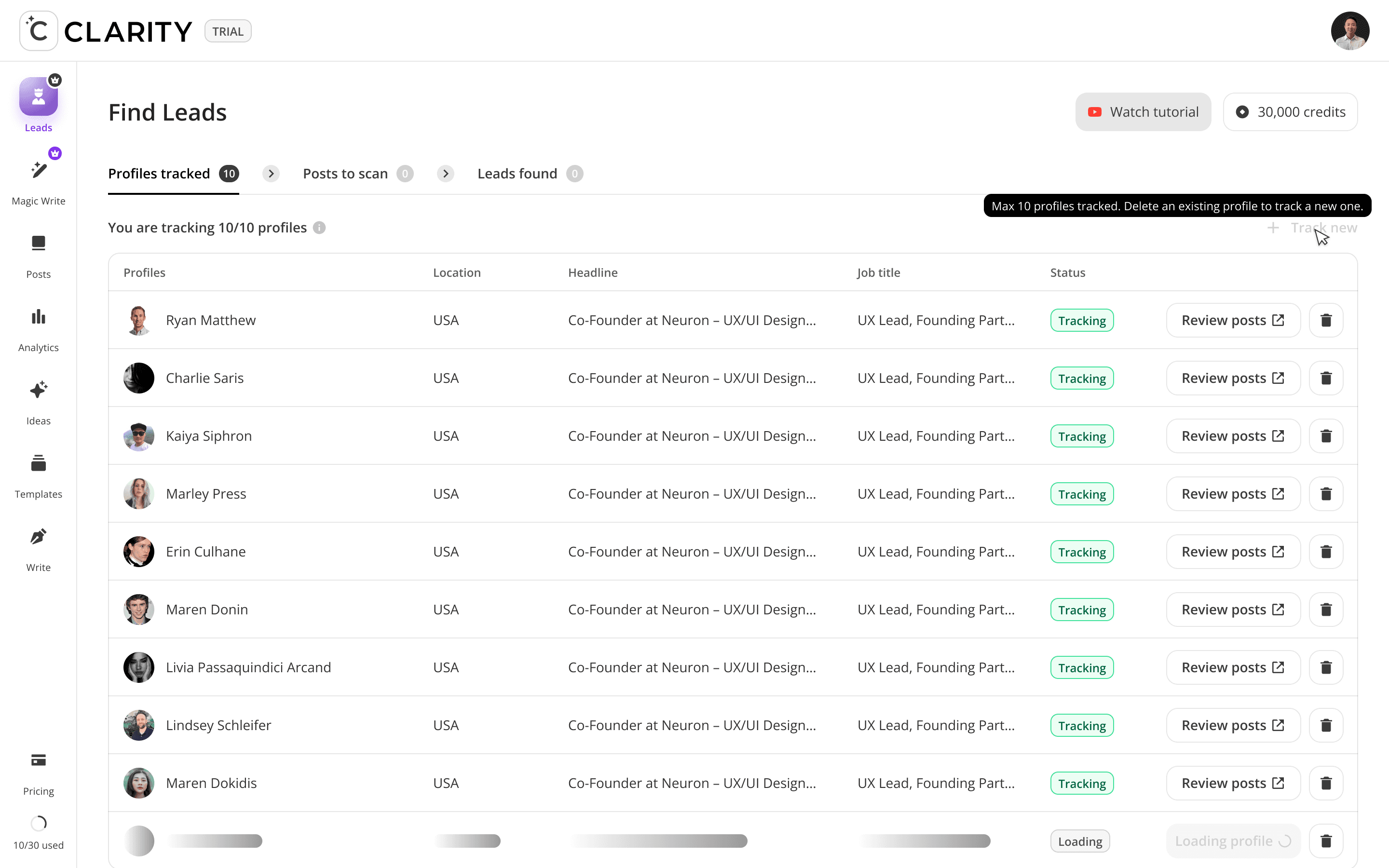
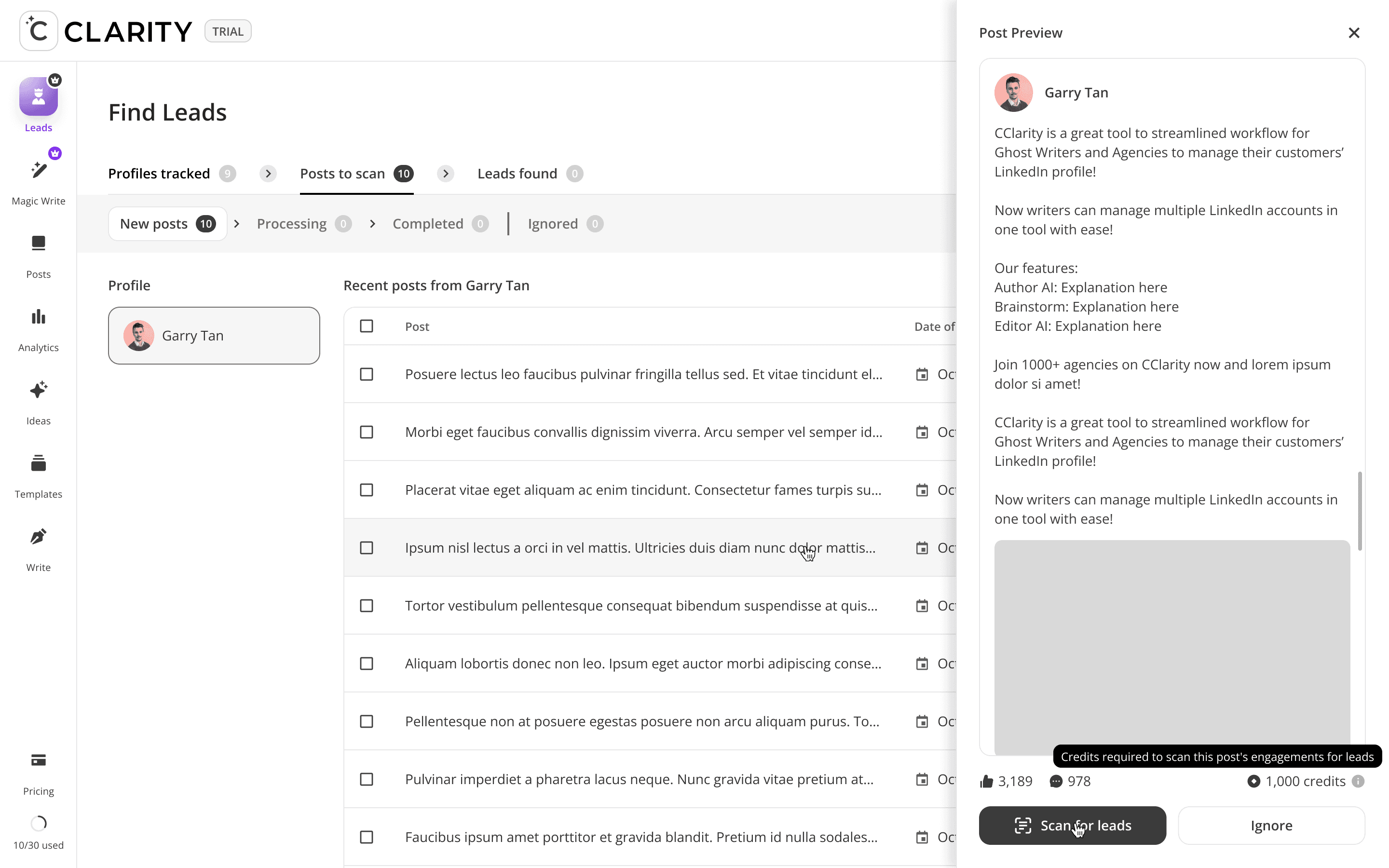
The top-of-funnel engine. Users track LinkedIn profiles including competitors, partners, industry voices, and Cclarity automatically scans their posts, extracts everyone who engaged, and surfaces those people as warm, pre-qualified lead candidates. The core idea: the audience already raising their hand around your space is your highest-intent pool of prospects.
Track a profile
->
Platform scans their posts
->
View who engaged with each post
->
Extract engager profiles
->
Push them into your Engage Leads pipeline
->
Draft a DM or content response


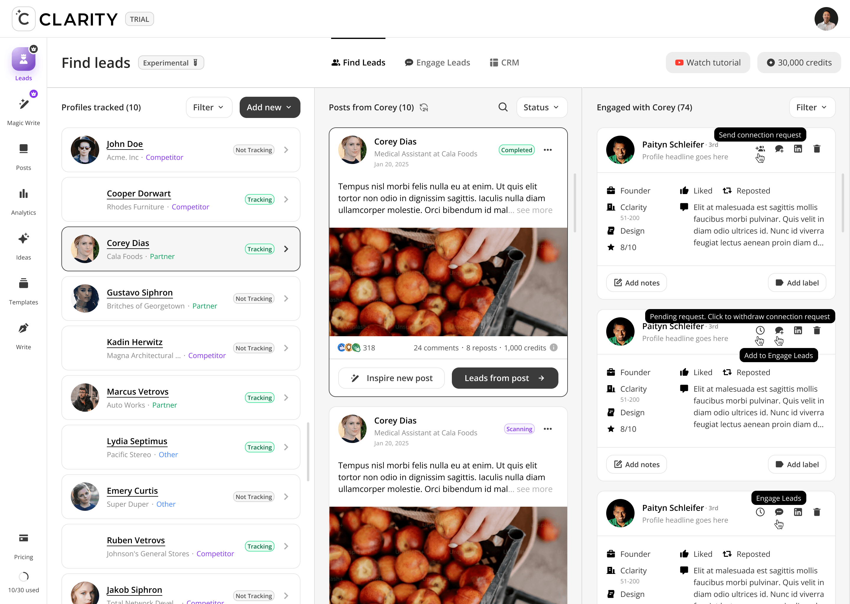
Design Decisions
Three-Panel Master-Detail Architecture
Left panel = who you're watching. Center panel = what they're posting. Right panel = who's responding. Each panel is driven by a selection in the panel to its left. Collapsing this to fewer panels would break the causal chain the feature is built on.
Post Scan Status as a Gate
"Scanning" posts display a yellow status badge and lock the "Leads from post" CTA. Only "Completed" posts unlock full engager extraction. This prevents users from acting on partial data and sets accurate expectations for the async scan process.
Credits as Visible Cost Signal
Each post card displays its credit cost inline (e.g. "1,000 credits"). Users see the cost before triggering a scan — making the consumption model transparent and encouraging intentional use of the tracking budget rather than indiscriminate scanning.
Design Challenges Resolved
Three-panel layout vs. cognitive overload
The screen presents three data layers simultaneously — tracked profiles, their posts, and the engagers of those posts. Early prototypes overwhelmed users. Resolved by making the left and right panels subordinate to the center: the profile list drives the post feed, the post feed drives the engager list. Selection always flows left to right.
Tracking" vs. "Not Tracking" — making the status meaningful"
Users were unsure what "Tracking" actually meant. Designed explicit status badges with distinct colors (green = active scanning, grey = paused) and tied the badge to a cost model — tracking consumes credits, so the toggle had real consequences users needed to understand.
Engager cards needed enough context to qualify, not just identify
Surfacing a name alone isn't enough. Each engager card shows role, company, score, connection degree, and the specific engagement type (Liked / Reposted / Commented with snippet). Users could make a qualification decision in under few seconds per card without opening a full profile.

FEATURE DEEP DIVES
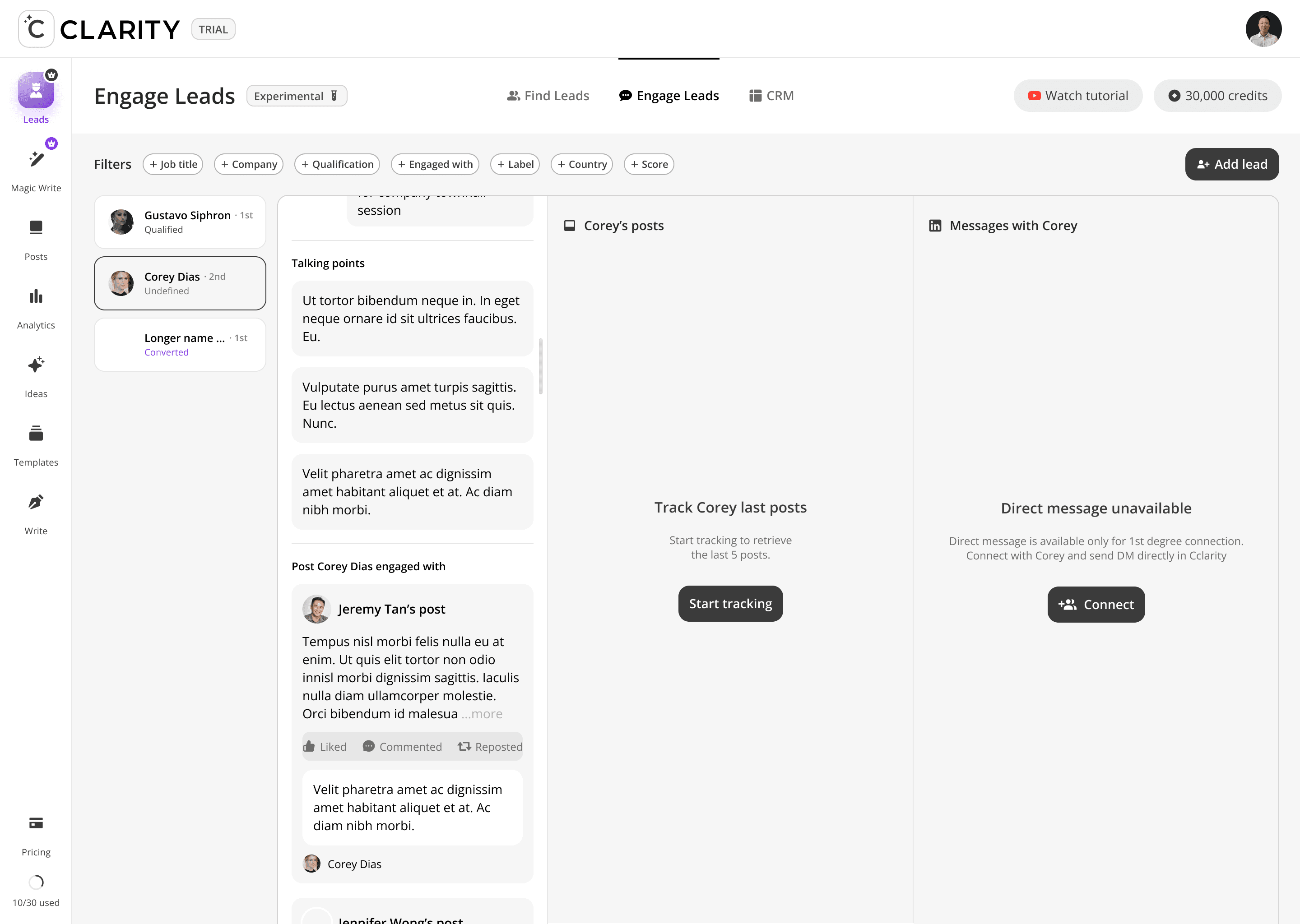
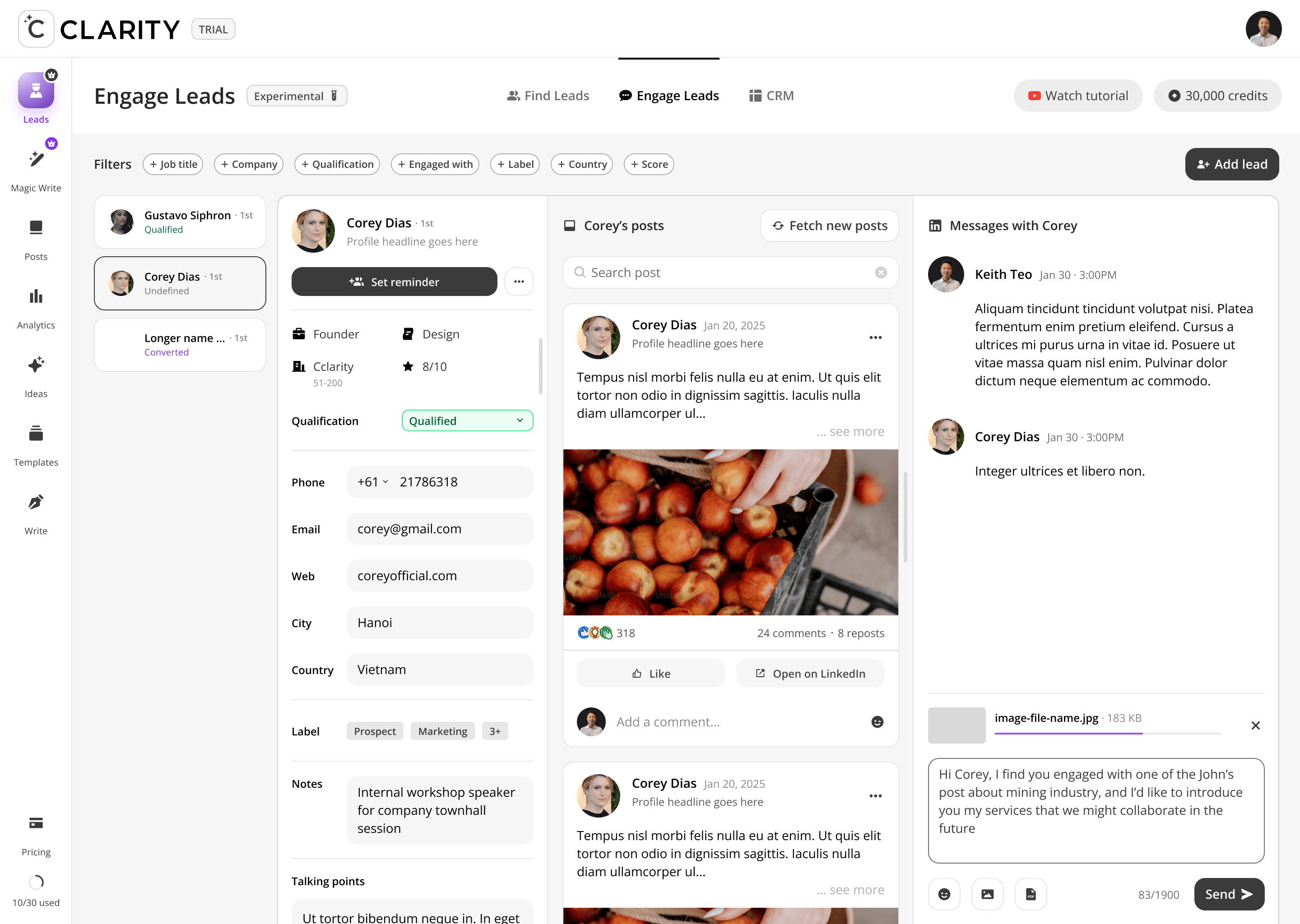
Phase 2: Engage Leads
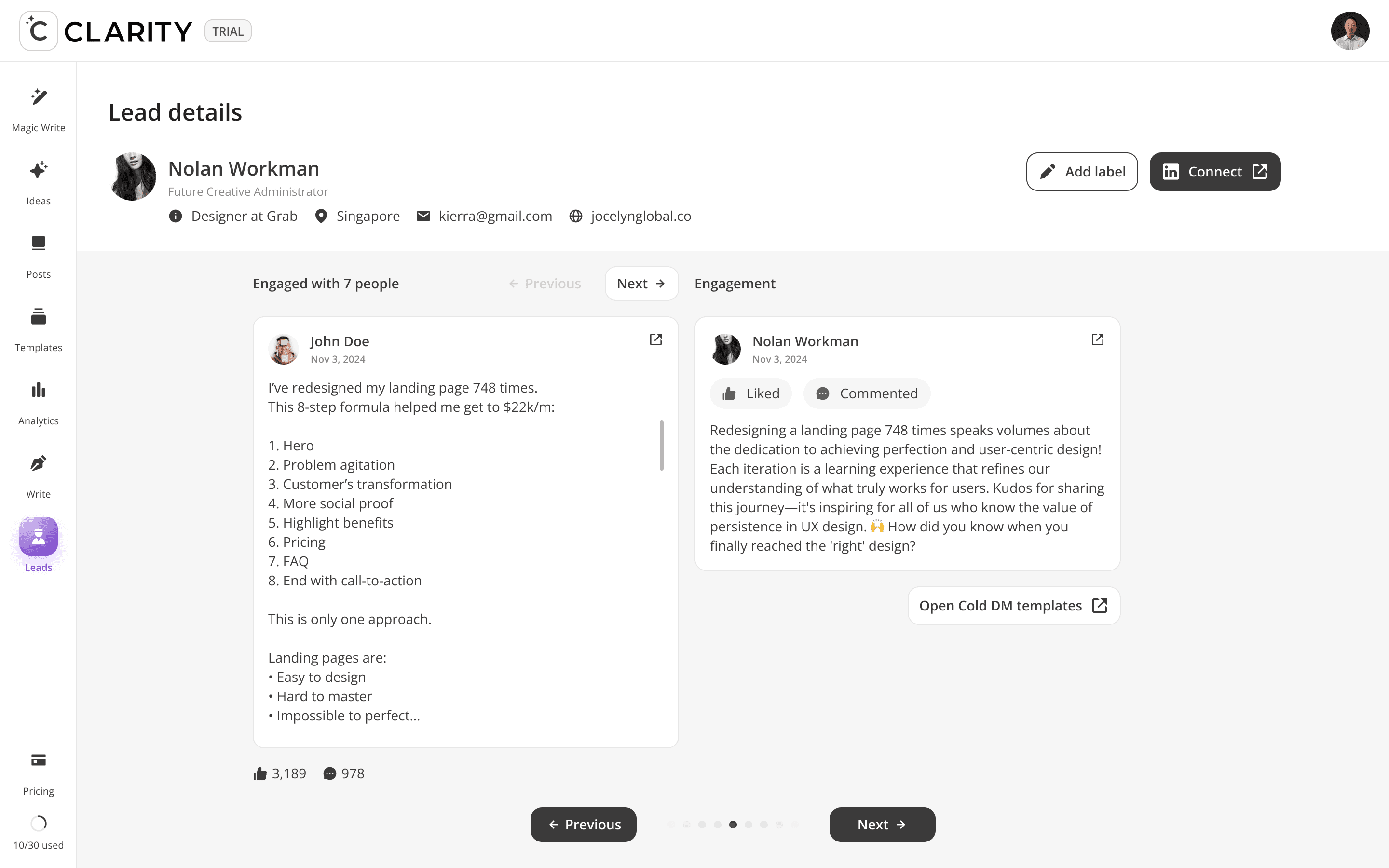
Where the pipeline becomes active. Once a lead is added from Find Leads, Engage Leads becomes the workspace for the entire relationship-building motion, like reviewing their profile, consuming and interacting with their content, and crafting a personalized DM — all within a single, unified view. The design philosophy here is deliberate warmth before direct outreach: engage with their posts first, then send the message.
Select a lead
->
Review their profile & qualification
->
Read their recent posts
->
Like or comment to warm the relationship
->
Compose a contextual DM using AI-suggested openers
->
Send and interact


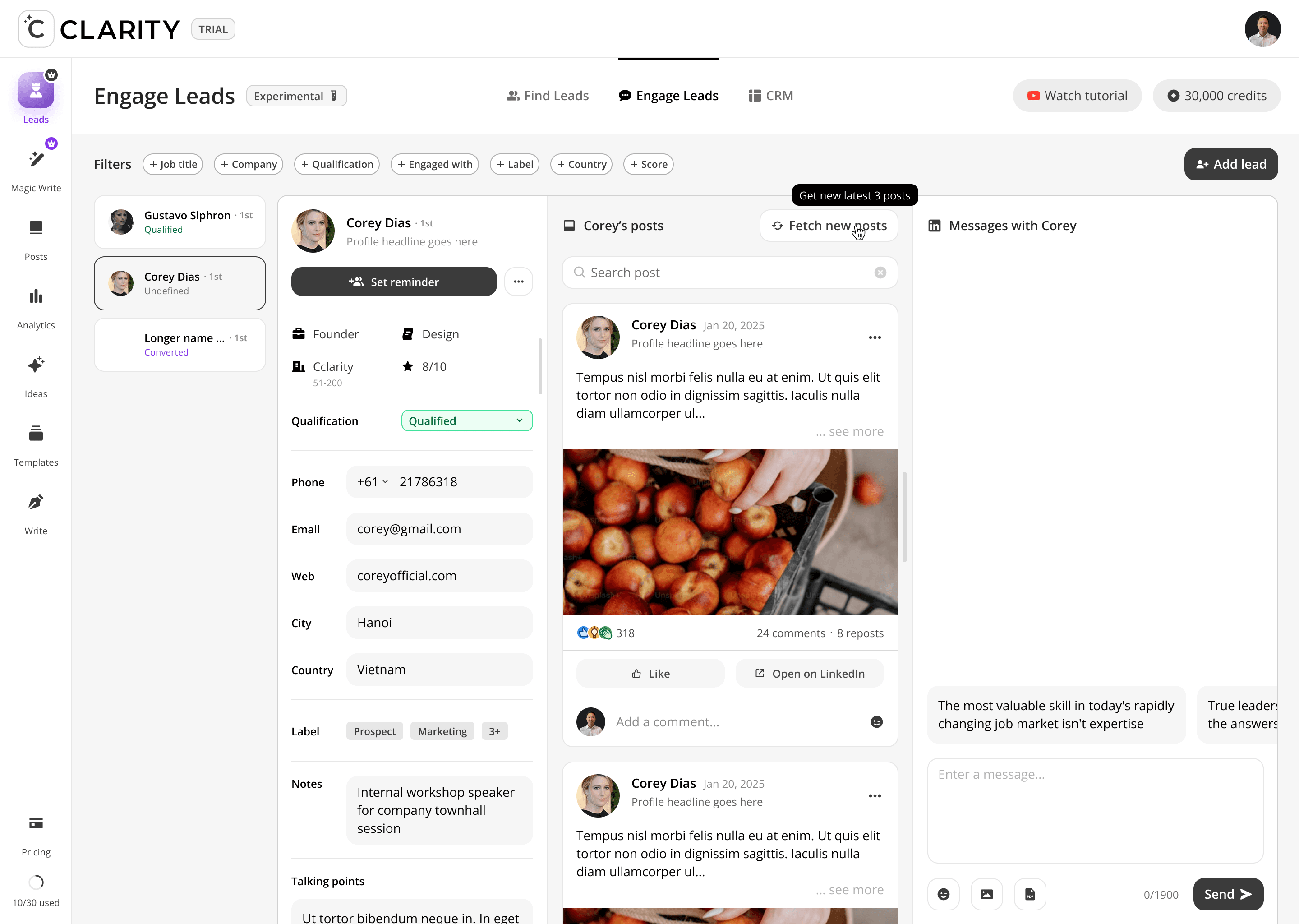


Design Decisions
Panel Repurposing vs. New Architecture
The decision to reuse the three-panel layout from Find Leads rather than design a new one was deliberate. Users moving from Find → Engage are in the same spatial context — only the content changes. This consistency shortens the learning curve and reinforces the idea that both features are part of one continuous workflow.
Warm Engagement Before DM — Enforced by Layout
The post panel sits between the profile and the DM composer. Spatially, users pass through the lead's content before they reach the message box. This isn't accidental; the layout embeds the methodology: read, engage, then message. Users who skip the middle panel are still exposed to it.
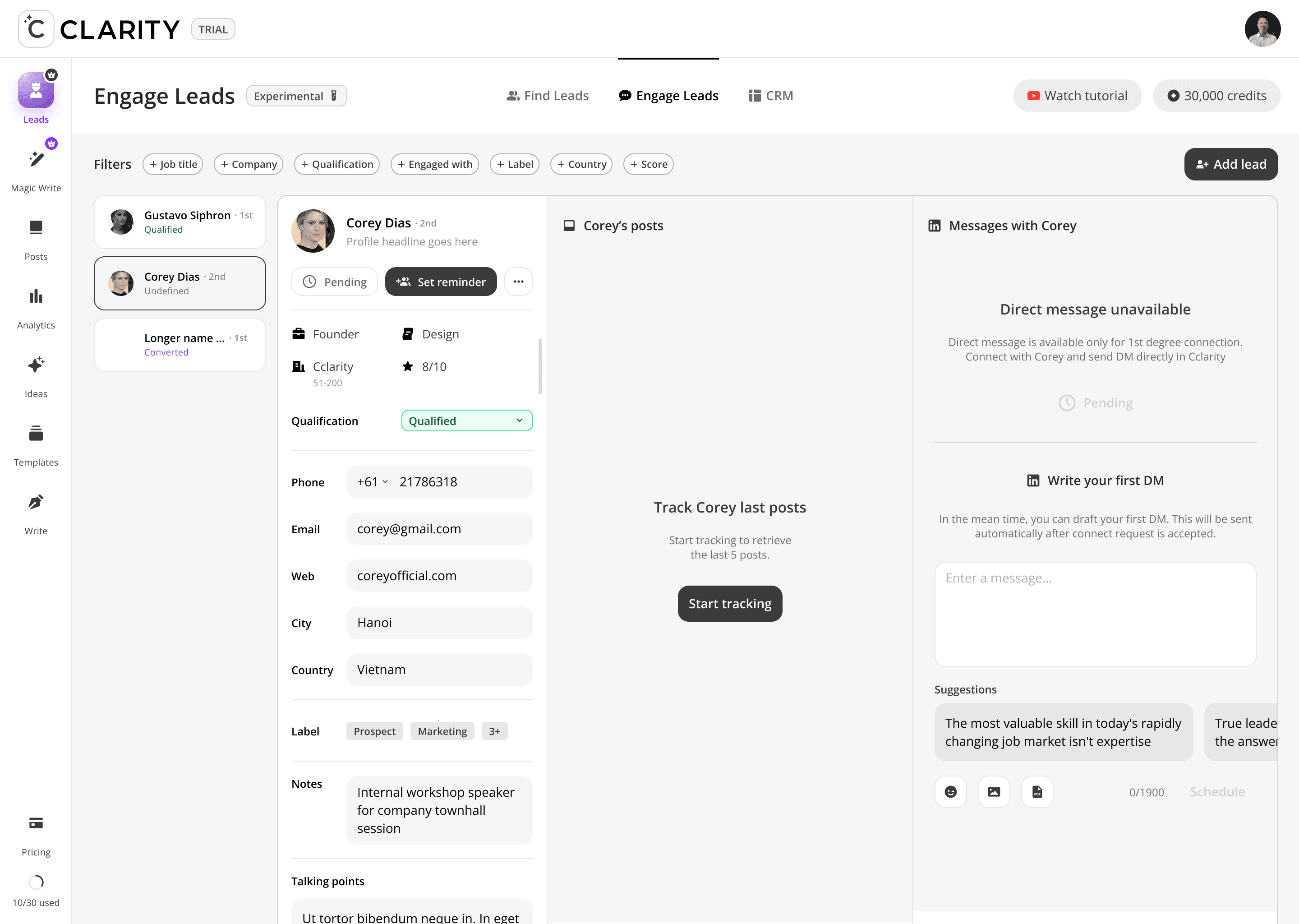
AI Starters as Scrollable Chips, Not a Dropdown
Message suggestions are displayed as horizontally scrollable preview cards above the compose box — not hidden behind a dropdown or button. They're visible by default so users encounter them naturally, reducing the chance they default to writing a generic opener when a personalized one is already available one click away.
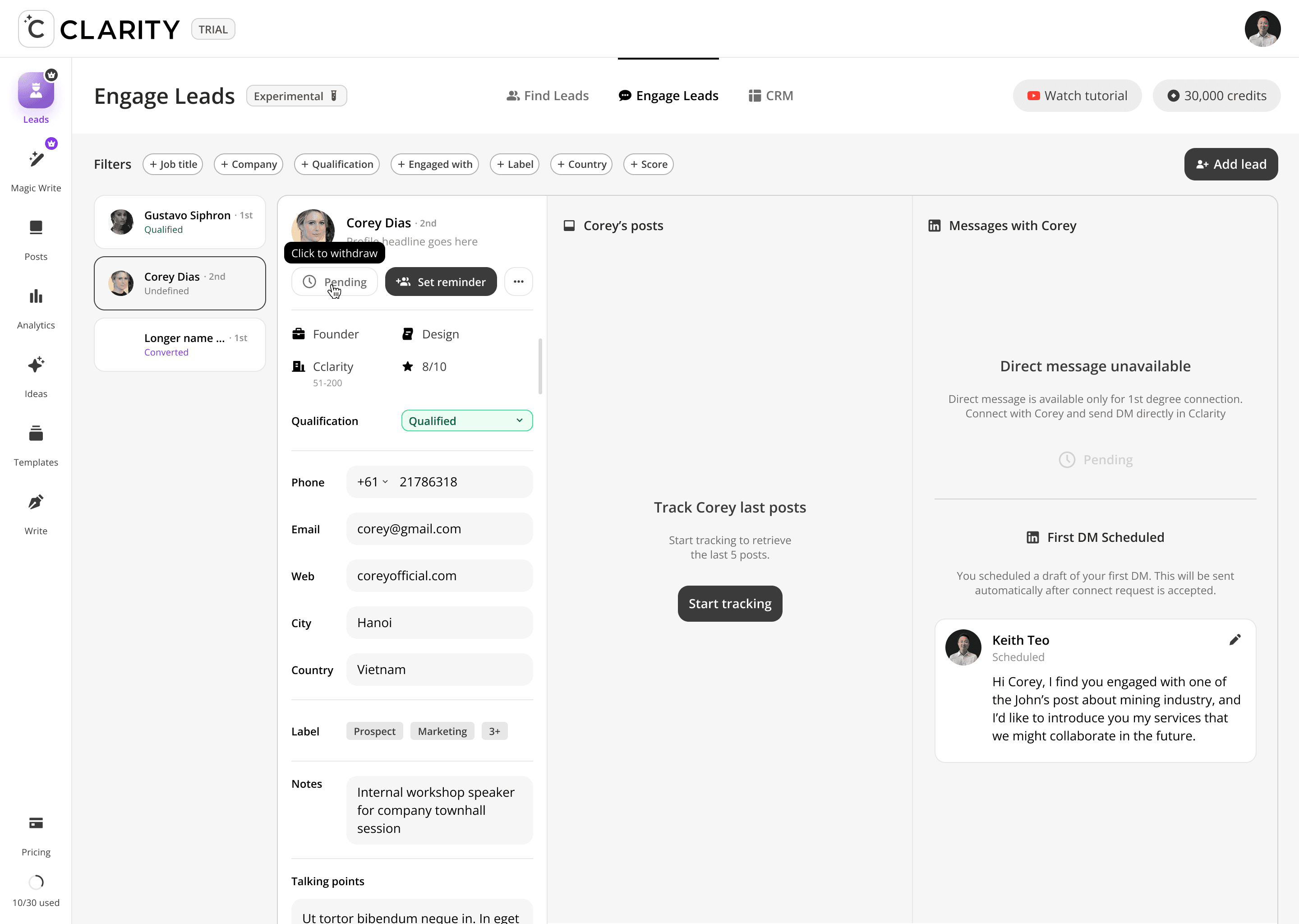
Qualification Status as a Live Dropdown
The Qualification field in the profile panel is an inline dropdown (Qualified / Unqualified / Converted / etc.), not a read-only label. Users can update a lead's status mid-conversation without navigating away — keeping the qualification data accurate at the moment it changes, not at the end of a weekly review.
Label Overflow ("3+") as a Navigation Cue
When a lead has more labels than fit in the visible tag row, a "3+" indicator appears. This signals that more context exists without cluttering the layout — tapping it expands the full label set. The pattern keeps the profile panel scannable while preserving access to richer segmentation data.
Design Challenges Resolved
Same layout, different purpose — reusing the three-panel architecture
Engage Leads deliberately mirrors the Find Leads layout (profile list / profile detail + posts / action panel) to reduce learning curve. But each panel serves a different purpose here: left is your active pipeline, center is research + warm engagement, right is DM composition. The shared structure does different jobs depending on where you are in the funnel.
Conditional CTAs based on connection status
When a lead is 2nd degree, the primary CTA is "Connect." When they're already 1st degree, the "Connect" button disappears entirely and "Set reminder" takes its place as the primary action. The UI reflects the real LinkedIn relationship state — no dead-end actions, no confusion about what's possible right now.
The post panel as a warm-up tool, not just a content feed
In Find Leads, the post panel is for lead extraction. In Engage Leads, the same panel becomes a relationship-warming tool — users Like posts and leave comments directly from within the product before ever sending a DM. This enforces the platform's "warm before you pitch" methodology at the interface level.
AI message suggestions grounded in the lead's own content
The DM panel shows horizontally-scrollable AI-generated message openers drawn from the lead's recent posts. The goal: every outreach message references something real the lead said or shared, making it feel personal rather than templated. The suggestions are a starting point — the user always edits before sending.
The pre-drafted DM is contextually personalized
The compose area pre-populates a draft that references the specific engagement signal that brought this lead in ("I noticed you engaged with John's post about mining industry..."). This lowers the activation energy of writing the first message and ensures the outreach isn't generic — it has a verifiable reason for reaching out baked in from the start.
Six-dimension filter bar for pipeline segmentation
The filter bar (Job title, Company, Qualification, Engaged with, Label, Country, Score) is designed for users with a large lead pool — letting them narrow focus to a specific campaign or outreach batch without needing to exit into a separate CRM view. "Engaged with" is particularly powerful: filter to all leads who engaged with a specific post, then batch-draft contextual DMs referencing that post.

FEATURE DEEP DIVES
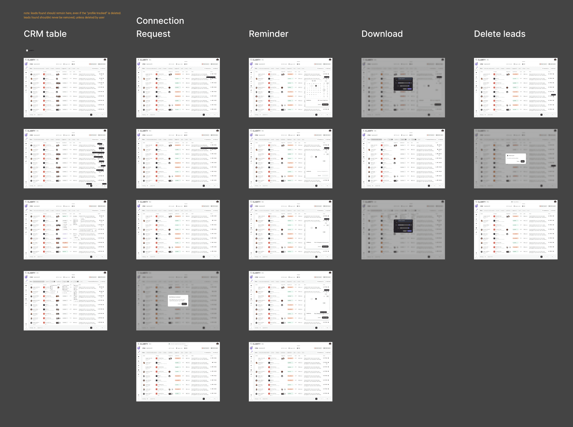
Phase 3: CRM
The full pipeline in one table. hundreds leads as rows, each fully editable inline — qualification status, labels, notes, and engagement history — without navigating away from the table. The CRM is the read layer and the write layer simultaneously. What makes it different from a spreadsheet: every cell is a live product action.
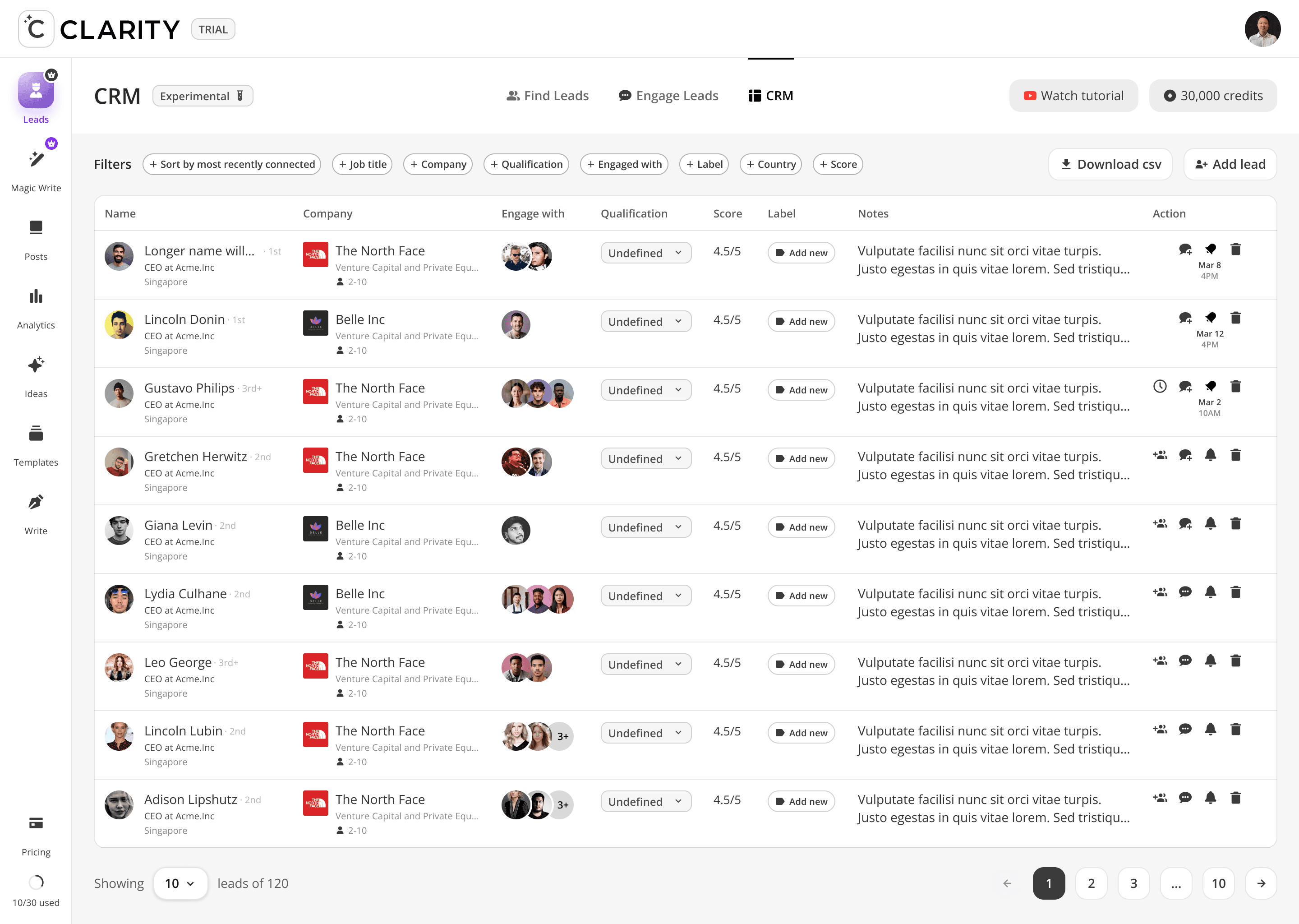


Design Decisions
"Download filtered as csv" — the label changes dynamically
When filters are active, the export button label shifts from "Download csv" to "Download filtered as csv." The user knows exactly what they're exporting — the current filtered view, not the full 120-row dataset. A small copy decision that prevents a common data export frustration.
"Engage with" column as photo stacks, not a number
Instead of showing "engaged with 3 posts," the column renders actual profile photo stacks of people who co-engaged with the lead. Relationship context is social and visual — who in your network is already connected to this person — not a count without spatial meaning.
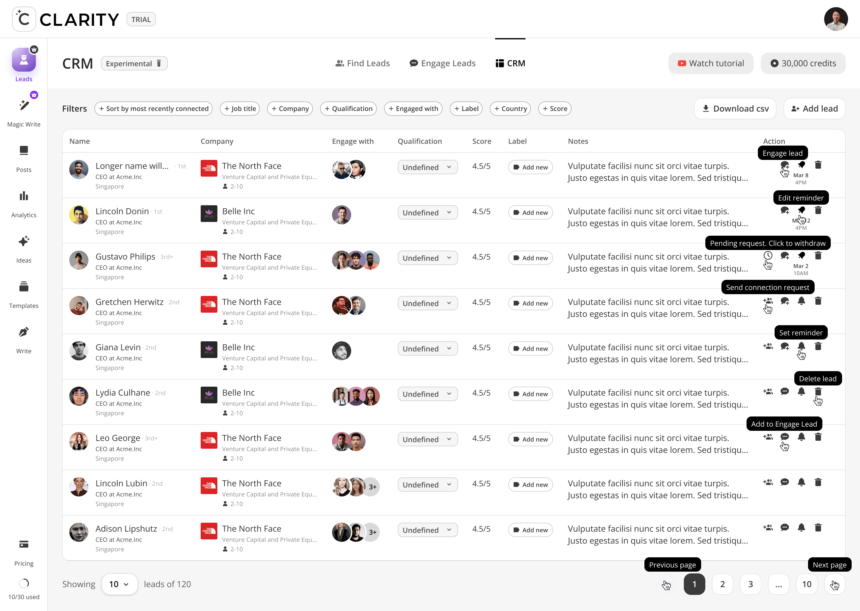
Action column with timestamps
Each row shows contextual action icons (DM, pin, bell, delete) alongside the timestamp of the last interaction (e.g. "Mar 8 4PM"). Activity recency is visible at the row level — no sorting or filtering needed to identify stale leads.
Design Challenges Resolved
Inline editing without a mode switch
Qualification updates via dropdown directly in the row. Notes expand to an inline textarea on click, confirmed with a checkmark, cancelled by clicking away. Labels applied via searchable multi-select from within the cell. No edit button, no modal, no save confirmation. Updating a lead costs one click.
Qualification as a color-coded system
Five states: Undefined (grey), Unqualified (muted grey), Qualified (green), Converted (purple), Disqualified (red/orange). Colors applied to the pill badge and to the dropdown's own background once selected — the color always travels with the status. A user scanning 120 rows can assess pipeline health visually before reading any names.
Labels as user-defined taxonomy with inline CRUD
The label dropdown contains a search field that serves dual purpose: filter existing labels or type a new one. Existing labels show a checkbox. New label names show "Add [label]" at the bottom. Edit and Delete accessible per label via "···" overflow. Full label CRUD without ever leaving the row, no settings page required.
Multi-filter chips with live counters
The DM panel shows horizontally-scrollable AI-generated message openers drawn from the lead's recent posts. The goal: every outreach message references something real the lead said or shared, making it feel personal rather than templated. The suggestions are a starting point — the user always edits before sending.
NOTES AND COMMUNICATION
User story based notes
From iterations, PRD creation and dev handover, we did a lot of user-story based documents to explain the details for UI and design decision in geneal. It basically uses user stories formula
As a [role]
+
I can do …
+
So I can …
With this approach, we can covers user roles and status, functions, interactions and a other UX notes to development, product manager and the CEO, Keith.

IMPACT
What shipped, and what changed.
Measured outcomes across the leads feature suite — from engagement with the new surfaces to platform retention and support volume.
$5M+
Pipeline generated for clients
200+
Meetings booked via designed flows
50+
Founders onboarded through product
7.8K
LinkedIn engagements analyzed
PRODUCT REVIEW
Before this, I was just trusting that things were happening. Now I open the app and I can see exactly where every conversation is. It's changed how I think about the whole service
Ken — Vehicle Automation Founder
Cclarity client, month 5+
REFLECTIONS
What this project taught me.
I learned a lot by completing this ambitious projects, from thinking clearly and problem solving, until how I manage expectation and still push my attention to details.
What Worked
Visibility over control
Founders want to observe, not manage. That single insight shaped every decision. Instead of giving users a pipeline they could drive, we built one they could trust — read-optimized, calm, always showing what's been done and what's next. Resisting the instinct to hand over control made the product more reassuring, not less.
3 seamless columns to navigate
Track profiles. Read their posts. Act on engagers. The three-panel layout stayed consistent across Find Leads and Engage Leads — same structure, different job. Users learned it once and never had to relearn it. Predictable spatial logic made a complex workflow feel immediate.
All in one lead management, but not overwhelmed users
The leads system covers a lot — signal tracking, scoring, post engagement, DM composition, pipeline, reporting. But users never felt the weight of it. Progressive disclosure kept each surface focused: actions appear when you need them, not before. Dense where it needs to be, quiet everywhere else.
What I'd Do Differently
Instrument before shipping, not after
I defined success metrics post-launch for several features rather than upfront. I now write a design hypothesis card before every sprint: "If we change X, metric Y will move by Z."
Mobile prototype earlier
Pipeline check-ins were heavily mobile, but I treated it as an afterthought until late in the process. An early mobile prototype in usability testing would have surfaced this and saved a layout refactor.
Audit the existing product's edge cases first
Adding a new layer means inheriting all the edge cases of what came before. I underestimated how much time I'd spend reconciling new leads logic with the existing content workflow.
What I Learned
Trust is a design problem
This whole feature was, at its core, a trust infrastructure project. Clients weren't churning because LinkedIn wasn't working, they were churning because they couldn't see that it was. Visibility = trust = retention.
Service businesses need transparency design
When a human team does the work on behalf of a client, the product's job is to make that invisible work visible. This is a distinct product design category with its own patterns.
The best feature sometimes restrains the user
Every instinct said "give founders more control." The research said the opposite. Learning to design against the obvious affordance and defend it with data; was the most important professional growth of this project.

MESSAGE FROM THE FOUNDER
" The decision I remember most: he pushed back on giving clients full pipeline control. Every instinct says give users more control. He came in with research that said the opposite. He was right. That single call changed how the whole product felt, from anxious to confident.
I've spent 13+ years in product. I know what it looks like when someone genuinely understands the problem they're solving.
Asyrof understood the problem. "
Keith Teo
Founder, Cclarity
Thanks for scrolling
© 2026 Asyrof